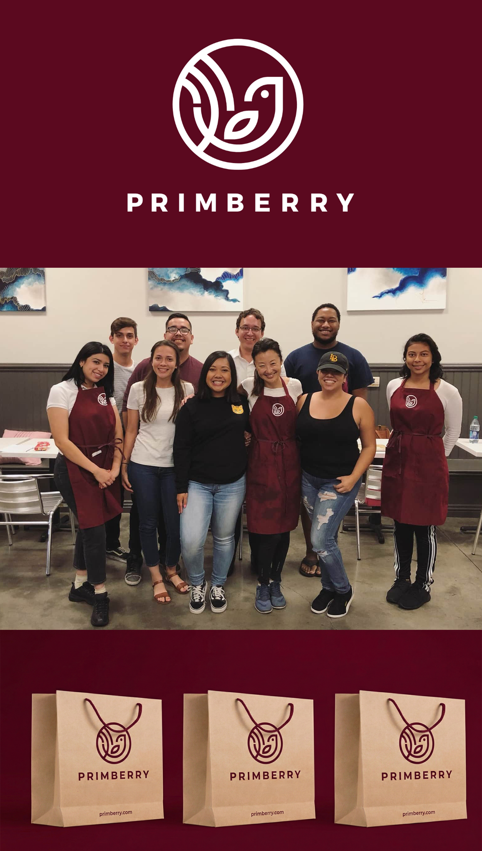
Primberry — Best of Bubble Tea
Primberry
The West Coast boba tea market is incredibly crowded and highly competitive. Primberry needed more than just a generic shop sign; they required a standout logo and brand identity that felt dynamic, fresh, and instantly recognizable. The challenge was to design a unique mark that would cut through the competition, attract foot traffic, and emotionally resonate with their target audience, ultimately aiming to "catch eyes and steal hearts."
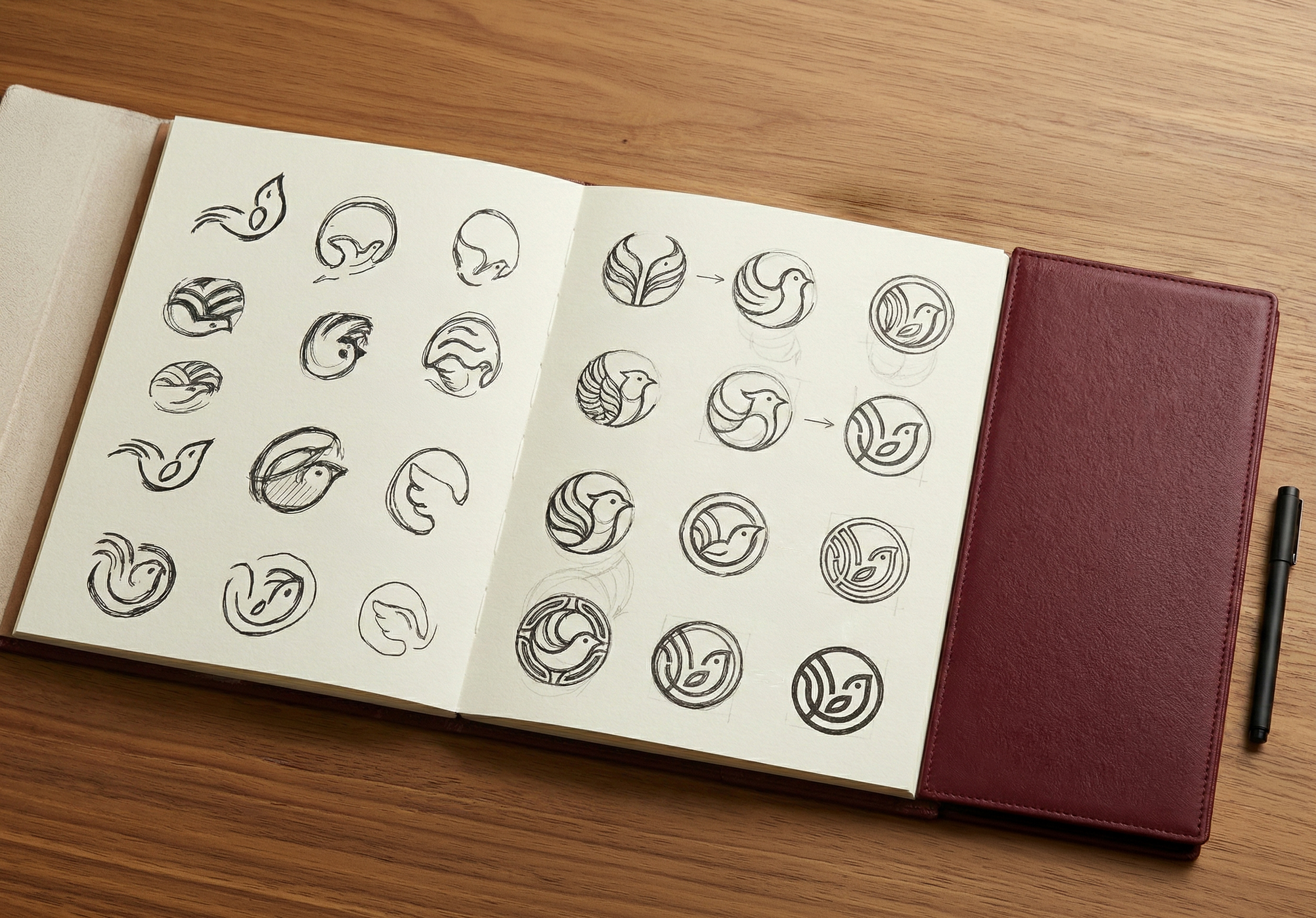


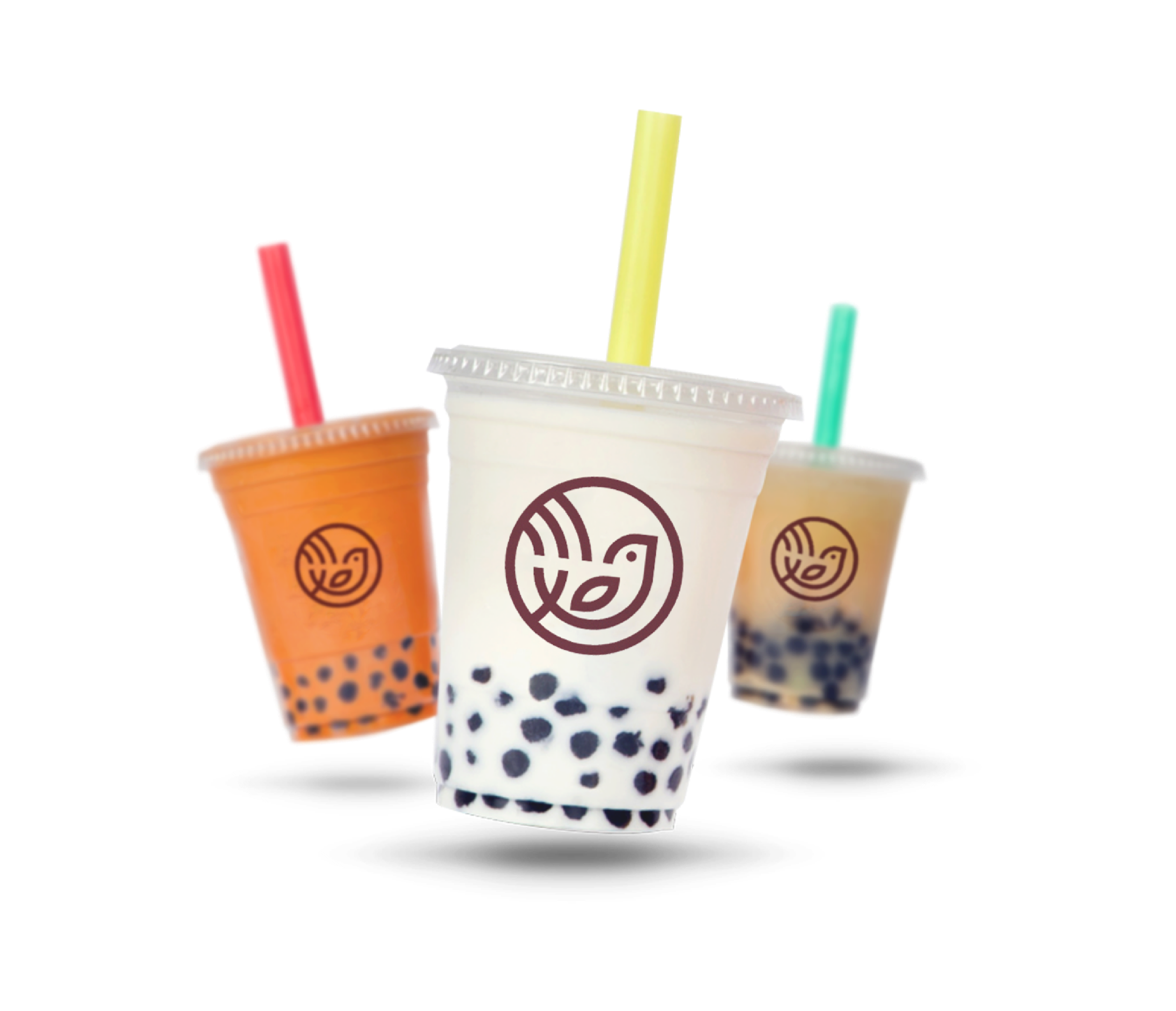
To set Primberry apart, I dove deep into the core goals of the business to guide the creative direction. I developed a comprehensive visual identity anchored by a dynamic and engaging brand symbol. My process began with extensive sketching, allowing me to explore and refine various concepts before bringing the strongest symbol to its final, polished stage. The resulting design was crafted to perfectly encapsulate the joyful, premium nature of their products.

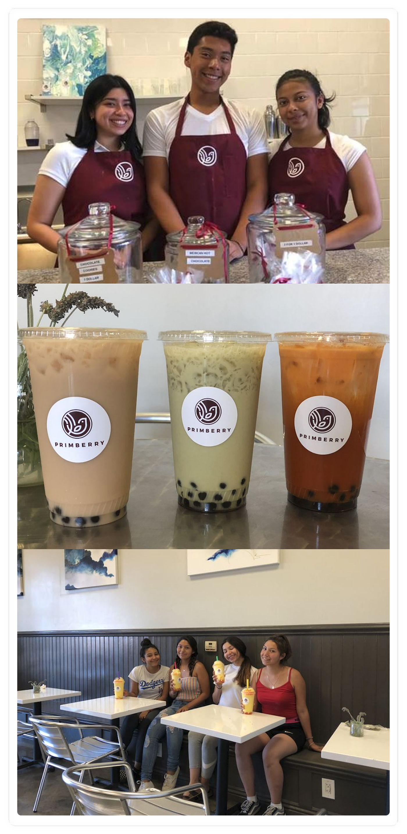
The final branding provided Primberry with a strong, confident entry into the California market. By delivering a distinct and memorable logo, the brand was equipped with an eye-catching visual foundation for their first storefront. The new identity successfully positioned them as a standout destination for boba and ice cream lovers, creating a warm, inviting brand presence ready to build customer loyalty.