Panavision — Supporting Filmmakers
Lee Filters - Panavision
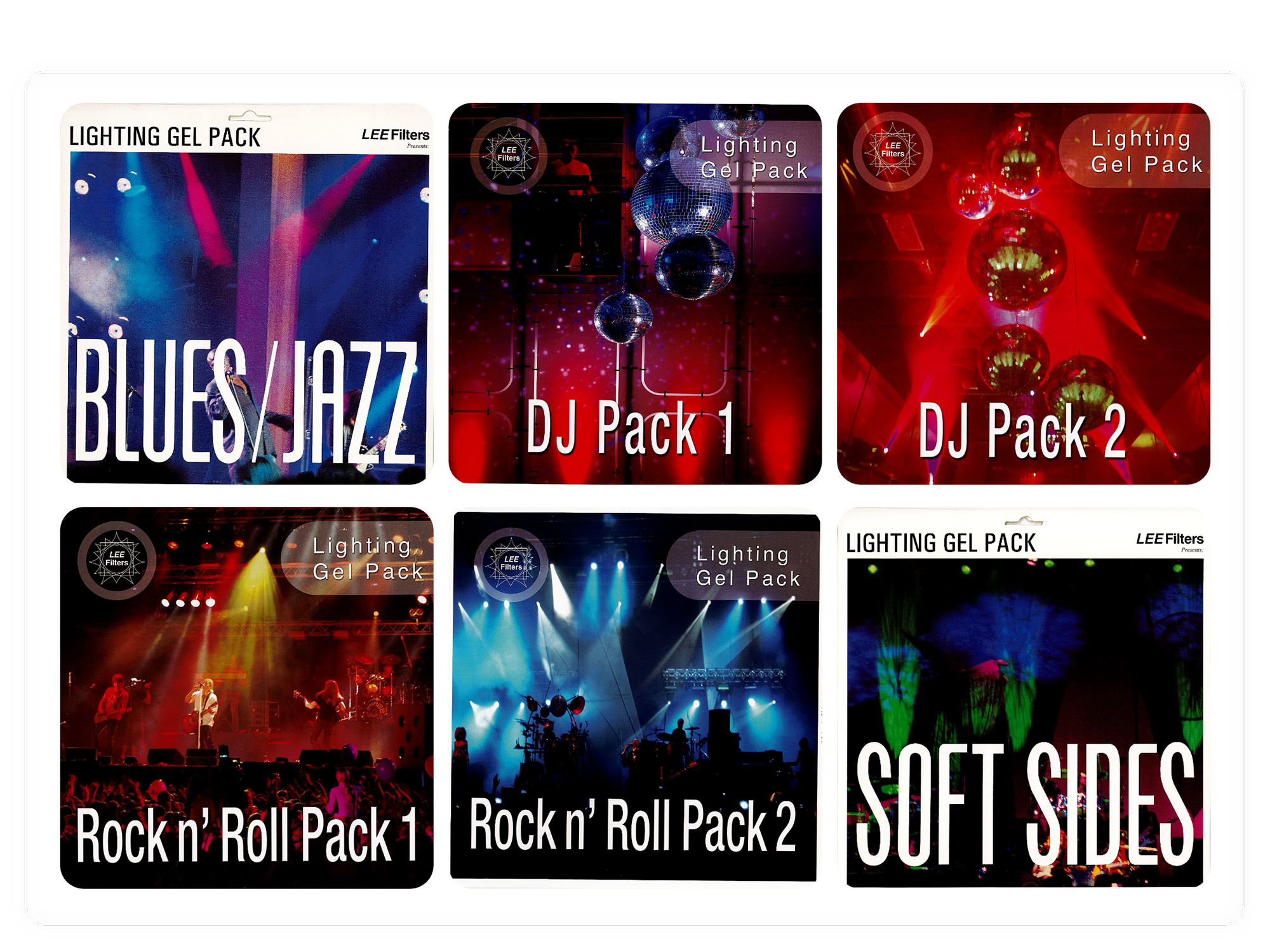

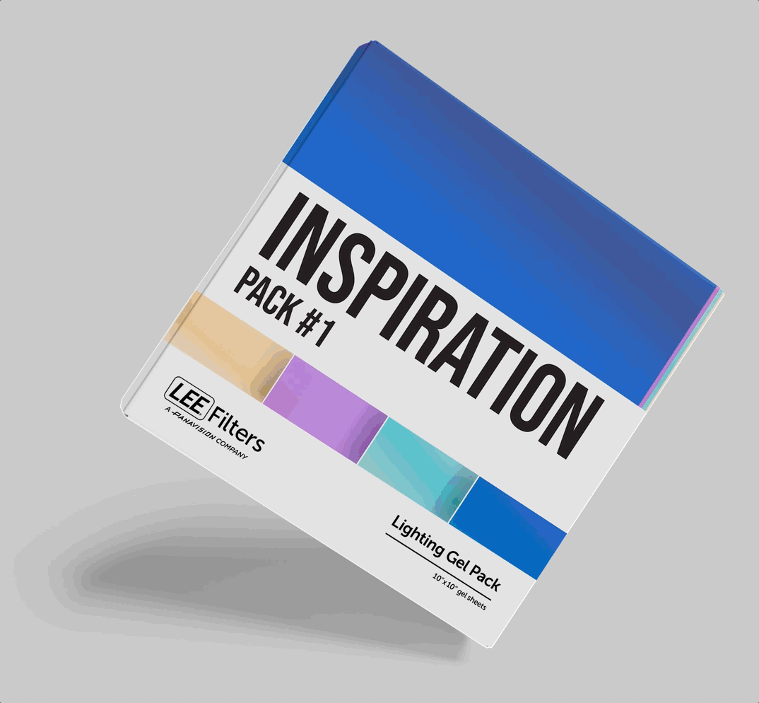
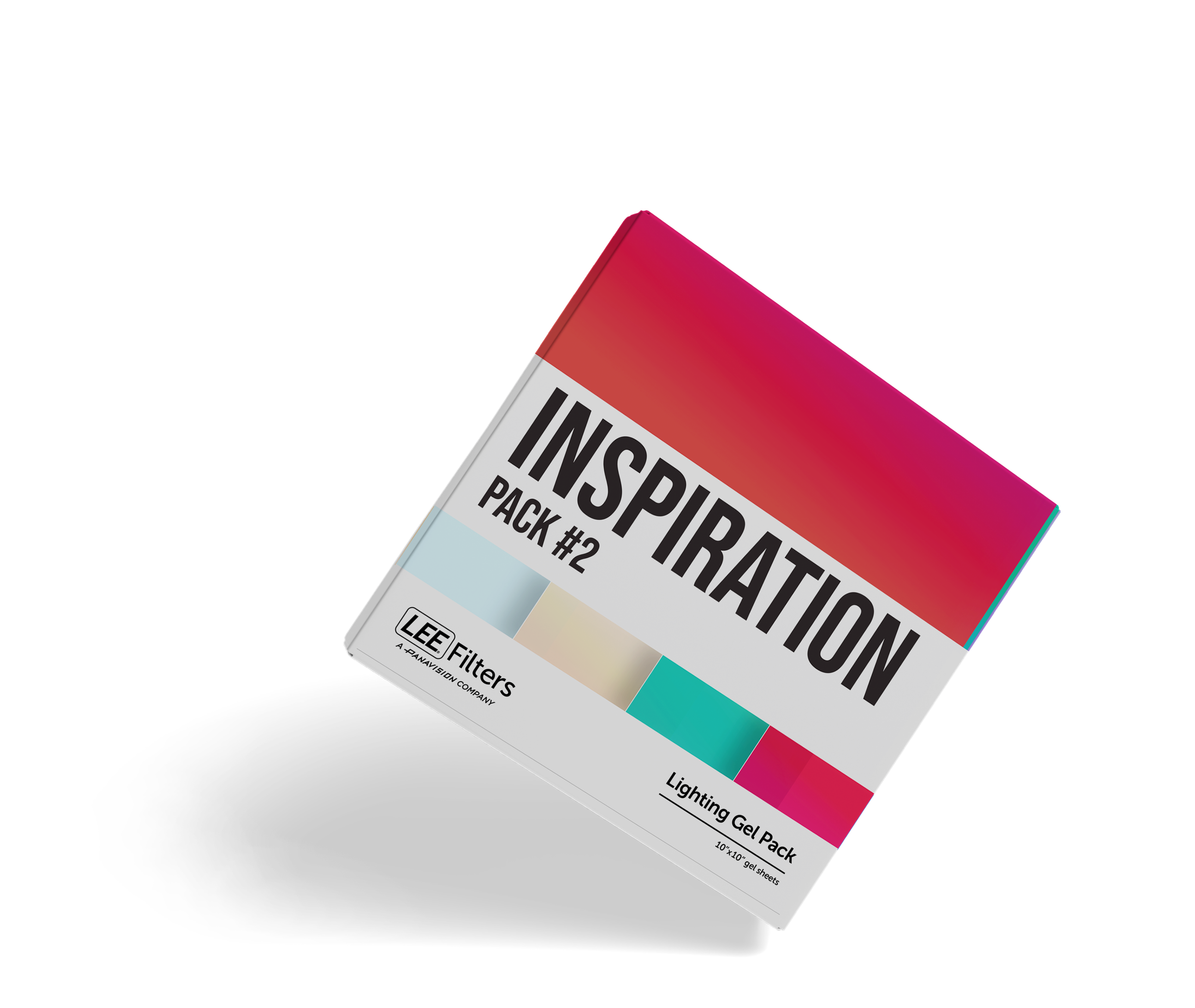
The brand needed to update the packaging designs across eight varying lighting gel packs. The primary challenge was moving away from outdated design styles and overly photographic imagery to create a look that was modern and consistent across the entire product line.


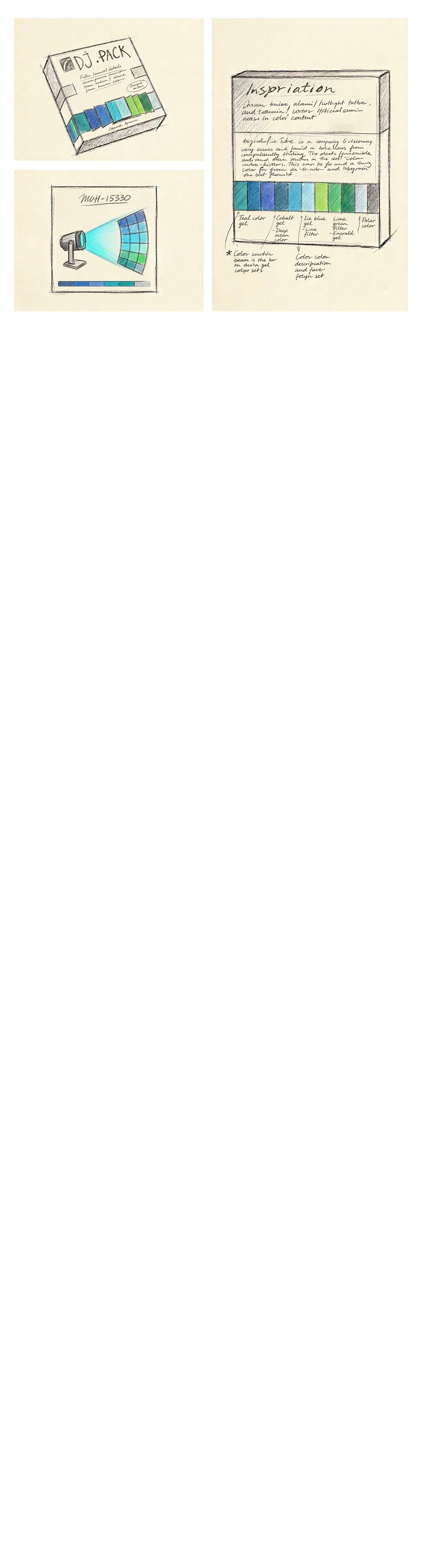
To modernize the packaging, I developed a fresh, vector-based design system using Adobe Illustrator. Drawing inspiration from the updated LEE Filters website , I strictly utilized their official brand palette featuring black,and gray, alongside the Museo Sans font family. To visually differentiate the eight packs while maintaining a cohesive family look, I explored creative representations such as unique color gradients for each pack's key artwork. I also restructured the visual hierarchy, establishing the name of the pack and swatch grid as the main visual.

The final deliverables provided LEE Filters with a clean, contemporary set of 12”x12” packaging designs. By adhering to the updated brand guidelines and avoiding photographic clutter, the new deisngs successfully unified the eight varying gel packs into a consistent, modern promotional suite perfectly suited for their campaigns.